Overview

Modality AI uses audio and video feeds from a patient’s computer to record 252 facial and voice biometric markers during a video call session. Patients engage with the platform by following audio and video prompts and speaking aloud. Applications for ALS, autism, depression and anxiety monitoring have been created using the Modality AI platform.

Problem space and scope

Modality AI was looking for a UX designer to assess and recommend solutions for data display and consumption. 252 data points are collected in each session, creating a need to display this information in

They were also looking for a designer to provide recommendations around the overall usability of the administrative pages. If time allowed, they were also interested in data visualization elements for a potential dashboard.

252

Users

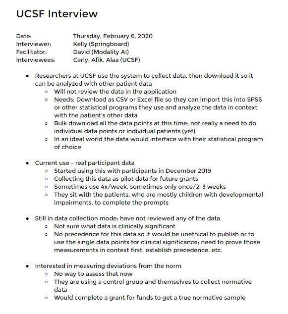
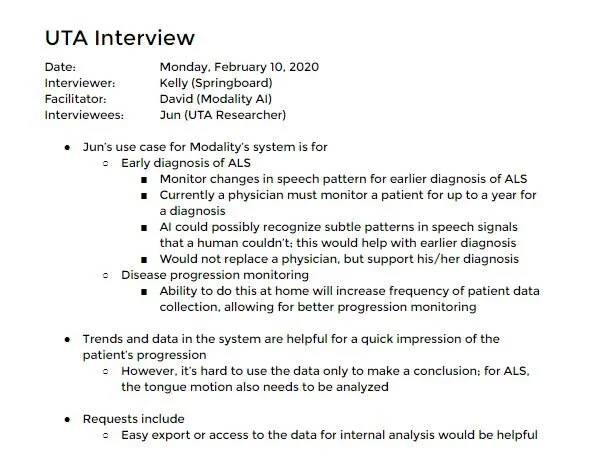
The current users are Modality AI’s research partners at University of California San Francisco (UCSF) and University of Texas Austin (UTA).

Target future users include pharmaceutical trial lab managers and healthcare providers. Both could use Modality AI’s system for managing patient progress, for either pharmaceutical trials or general health monitoring.

My role

I entered a 6-week engagement with Modality AI as part of the UX boot camp program I took via Springboard. I worked solo on this project, evaluating Modality AI’s current platform, crafting and executing a research plan, designing prototypes and testing, and providing final design recommendations to the company.

Constraints

  1. Limited users

    • The current users (university researchers) were under grant deadline pressure during my engagement with Modality AI. The company requested that I only do one round of user interviews with them and recruit other users to complete the usability tests.

  2. Limited experience in the application

    • The university researchers had not yet spent a lot of time engaging with the platform so their feedback was limited.

  3. 40-60 hour engagement

    • My engagement with Modality AI was supposed to be limited to 40-60 hours of work as it was an “internship” for a bootcamp program.

Process

[insert process infographic here]

 DISCOVER

Design brief & scope definition

I had an introductory call with David, the CTO and my primary contact, to learn about the company, their product, their users and the scope of the project.

Based on our first discussion, I drafted and reviewed a scope document. We agreed to a plan of user research, design, usability testing and design delivery over the course of 4-6 weeks.

Deliverables

  • Navigation and information architecture assessment

  • Redesign of the red route within the administrative pages

  • Redesign of the data tables

  • Dashboard with data visualization elements

Ambitious? Sure! :)

Research plan

To focus my efforts during the Discover phase, I developed a research plan consisting of three parts: heuristic analysis, best practice research and user interviews.

Heuristic analysis

As I familiarized myself with the Modality AI environment, I used Jacob Nielsen’s 10 Usability Heuristics for User Interface Design as a guide. In my deep analysis of the administrative pages, I discovered that Modality AI’s data tables and information architecture demonstrated hallmarks of adequate user experience design. However, I was excited to identify opportunities to improve the overall user experience and set Modality AI apart from its competitors.

Unfortunately, one opportunity I discovered was that Modality AI’s brand colors and logo of an orange and gray color combination fail accessibility color contrast standards.


Best practice research

Because one of Modality AI’s biggest concerns was the data table design, I explored UX best practices for data table design.

[CHANGE IMAGE TO ONE WITHOUT PRIORITIES]

User research 

To best prepare for the limited time I would have with current users, I outlined my research objectives as questions and drafted an interview script to ensure I would successfully answer the following questions.

Research questions

  1. Why did customers begin using Modality AI?

  2. What do users hope to gain from using Modality AI?

  3. How do users interact with the data and files in Modality AI?

  4. What are the user’s goals when using Modality AI?

  5. What pain points do users experience?

User interviews

Modality AI currently has a small set of university researchers. Over two sessions, I met with four university researchers who have started using Modality AI within the last several months. Their use of the native data tables was limited as they’ve mostly been focused on validating the biomarker results that Modality AI collects. However, I was able to identify their use cases, motivations and future goals.

UCSF interview.JPG
UTA interview.JPG

 Define

Research insights 

I analyzed the interview notes and common themes were obvious without an affinity diagram.

  1. Users have not yet had time to review the data tables in depth.

  2. Users are busy validating results and planning for demonstrating clinical significance and validating clinical application of the data.

  3. Users need the ability to download the data (to import into statistical analysis programs).

  4. Users find the long list of columns difficult to follow.

  5. Users request responsive design for use on a variety of devices.

User persona

Even with limited information, I was able to develop one user persona for the existing users. I did this particularly because the users all had one major request that I wanted to emphasize: downloading data.

[insert image]

Research synthesis and scope refinement

After completing user interviews, it became clear that the users had only limited experience navigating the administrative pages and reviewing the data tables within Modality AI. Without much feedback from them, and considering the maturity of the current design and functionality, I scheduled a meeting with my contact, David, to discuss the scope of the project.

I shared that, absent much feedback and access to the current users, I felt I could best contribute to Modality AI by focusing my efforts on laying a solid foundation for future growth and scalability. This would involve a redesign of navigation, solid information architecture, optimized data tables, and overall maturity of the administrative page design.

I also shared that it seemed too soon to begin building data visualization elements for the system without knowing what users.

[It’s like adding frosting to an unbaked cake.]

David supported the scope change.

How might we?

To conclude the Design phase, I completed one of my favorite UX activities: crafting How Might We questions. These questions are so helpful in guiding every subsequent activity and phase of the UX effort. I consider them my “north star.”

  1. How might we design/create/build a solid foundation of administrative pages, information architecture and navigation to support future growth to a variety of user types?

  2. How might we meet emergent needs for download capabilities?

  3. How might we design for the data to be easily consumable?

 Design

 Ideation/sketching 

To kick off the Design phase, I started ideating and sketching solutions to answer the How Might We questions. Some of the design decisions were already mentioned above (such as removing patient results from the landing page) and my designs reflected this.


[insert sketches]

I reviewed my sketches and selected two designs to pursue. They were similar, with the biggest difference being the navigation. I felt a top navigation would reclaim much needed real estate and would be the better option. 

However, if many new pages or functionality (like dashboards, reporting features, etc) were added to the platform in the future, a sidebar navigation could better accommodate this without having to hide/nest some pages in the top navigation.

Wireframes

Once I was satisfied with my sketches and felt I had a direction for the designs, I started wireframing them in Figma. I opted to use Figma because __________.

In the first round of wireframes, I only made a very basic filter function.

[insert wireframes]

Early testing 

 DeLIVER